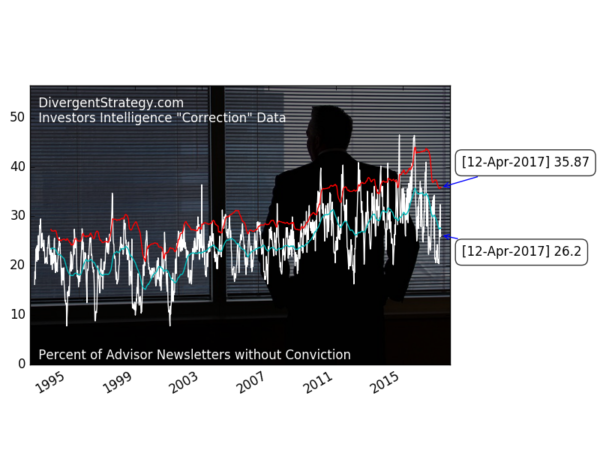
Investors Intelligence: Correction data not extreme (Apr 12)

Investors Intelligence produces a weekly survey of 100+ independent newsletters and reports the findings as percentage bullish, bearish, or “correction”. Tom McClellan has a great overview of the lattermost data in this older post. The correction camp is for those abstaining from being bullish or bearish the stockmarket. When the correction data makes rapid relative changes, it shows advisors gaining or losing conviction.
The headline chart above shows the correction data with bands to show sharp changes in the data. The light blue lower band is the average 52-week correction data. The bright red upper band is 1.5 standard deviations above the average 52-week correction data.
Tom points out that spikes in the data can indicate important market bottoms. As you can can see in the next chart, the data does not always line up with market bottoms in the S&P 500 index. Yet it does seem to overlay periods with a lot of sideways chop and/or dips. The pink areas are periods where the correction data has moved above the upper red band, but has not dropped below the light blue band.

Just as important as marking bottoms, I find that moves in the data also precede or coincide with spikes in the CBOE VIX index, as it indicates better-informed investors are expressing newfound uncertainty.

Again, the indicator is not perfect. I plan to review combining other signals generated by Investors Intelligence, to see if changes in the number of bulls & bears, together with the correction data, create a better warning indicator.


